In 2020, as we began building a new product offer for our subscription base, we realized something was missing. Functionalities were shipped, but they didn’t feel part of a whole.
Project / Deliver’s Visual Tone
Role / Product design manager
Company / WeTransfer
Product / Deliver Alpha
Year / 2020

Background
In 2020 I was part of the team leading the Transfer product with the goal to expand the value proposition of our file sharing service.
That gave birth to Deliver, a product for creative professionals (in the photo, video, and media industry) to create living statements of work. With Deliver, users could outline a promise of work, keep clients updated and impress them with beautifully organized deliverables.
Problem
The product team understood Deliver’s purpose but had no guiding principles to anchor discussion on features, design, and implementation.
Solution
Create a product framework to align and rally our team around and provide an initial visual direction.
Before & After
Before
Designers were solving problems effectively but lacked a cohesive and recognizable visual direction
Critique of visual and product design was challenging since we lacked principles.
After
Product framework featuring product pillars and principles allowed to define the initial visual direction to align the design
Execution
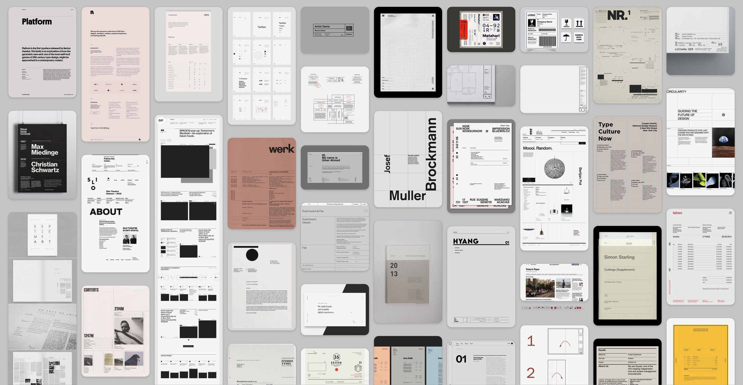
Defining the product framework and visual tone went hand in hand. As we gave shape to the product pillars and design principles, the designers and I created a mood board to explain visually how we envision a specific area of the product to feel. This process was essential to develop together a shared visual model to reference and from which we could develop our language.
Product framework
Creating a product meant distilling months of research, competitive analysis, strategy, and product shaping into a digestible document that anyone in the team could understand. The 20 slides that resulted from it, which you can see below, cover Deliver's value strategy and product approach. They set a specific target and served as a foundation for our product decisions as we continued shaping this product.
Visual tone
Deliver was ideated to support a project throughout its entire lifecycle — from the statement of work until the project’s end, works should be delivered at its best. For us, this meant creating a product that felt as simple as writing a document but with an intrinsic visual appeal that would make this document worth sharing even when no work was uploaded to it, yet. To achieve this, we looked for references in printed materials featuring primarily text or beautiful tables and title blocks. Technical drawings, shipping labels, and letterheads are some other examples you can see below.
Deliver was characterized by three primary signature views/moments:
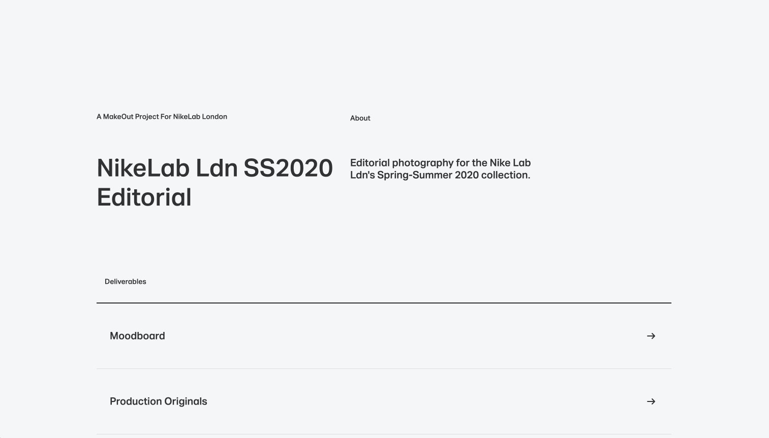
The statement of work: the moment in which deliverables are outlined
The deliverable: the view where a round of work will exist
The published page: once the project is complete, it’ll turn into a showcase
We knew success depended on nailing the first two, so we focused the visual tone on those as a start. For the statement of work (SOW), we wanted to create a document that would look worth sharing with the client even when it’s empty. The SOW consisted of a title block and a list of deliverables. Below you can see some of the iterations for the title block. The deliverables list would require a case study on its own.
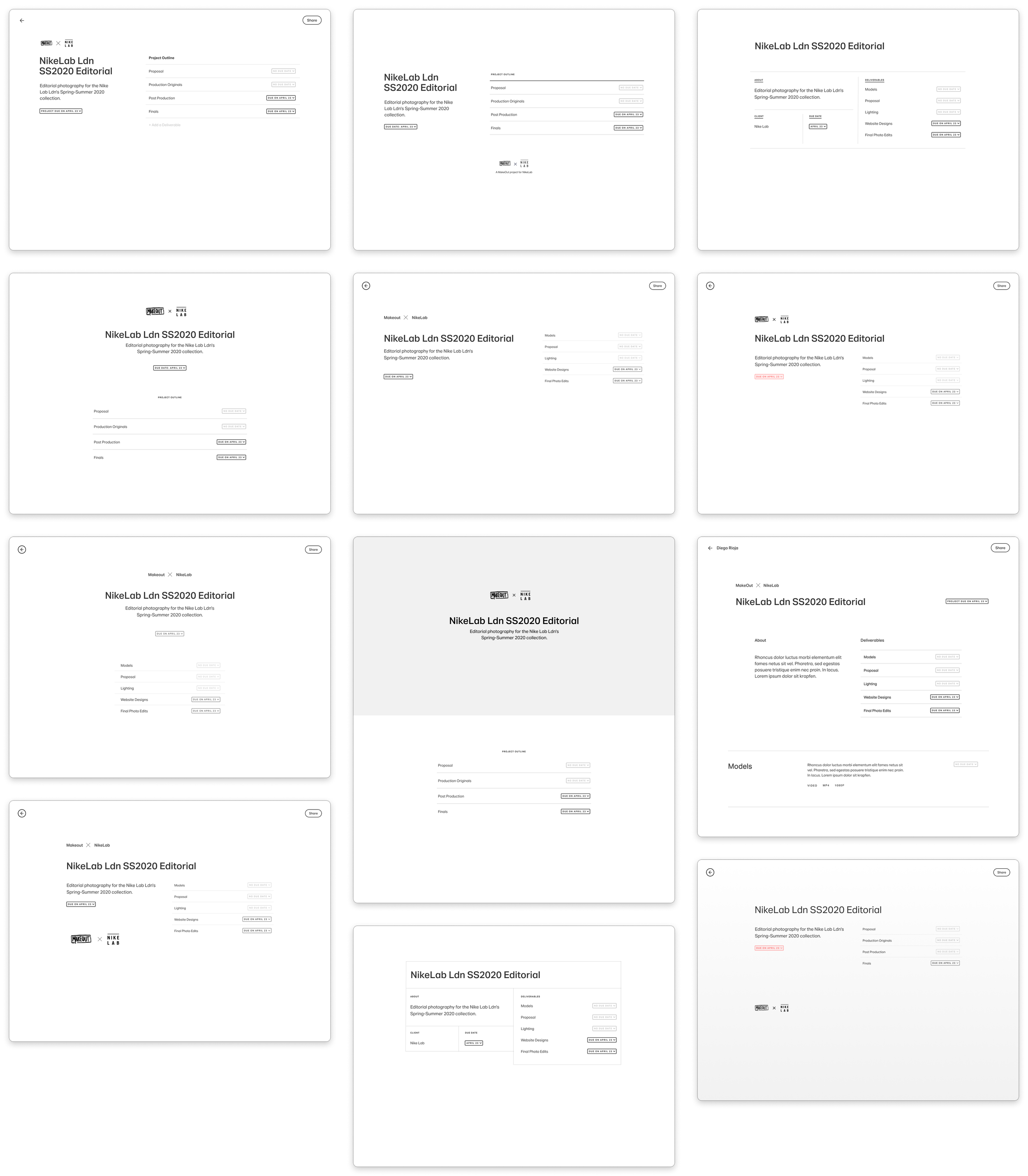
The deliverables list was the most controversial area to define. The most debated decision was whether or not it should include thumbnails of the uploaded work or not. Eventually, we opted to keep each deliverable close to its initial state to keep this page from changing too much as the project progresses and instead act as a quick overview of the state of work.

Deliverables could be expanded to view their content, of course. However, knowing how much our users struggled with clients getting lost in the progress of a project, we wanted to make sure expanded deliverables looked like they belonged to their parent page. To make this relationship as tangible as possible, I designed deliverables to work as full-page modals that would expand from the statement of work itself. Once expanded, some elements from the parent page, such as the title and footer were still visible to underline the hierarchy.

I eventually prototyped a basic version of this interaction model and visual direction in JavaScript to get designers and engineers onboard on this fundamental navigational behavior.
More Figma prototypes were made. These include alternative ways of visualize deliverables and title blocks.