When we launched Portals & Reviews, we gave our users the ability to get feedback on their work. Yet, we had to take an extra step to make that feedback work for them.
Project / Report
Role / Lead product designer
Company / WeTransfer
Product / Portals & Reviews
Year / 2020

PLEASE NOTE — This page hosts several GIFs. Based on your connection, this might impact your viewing.
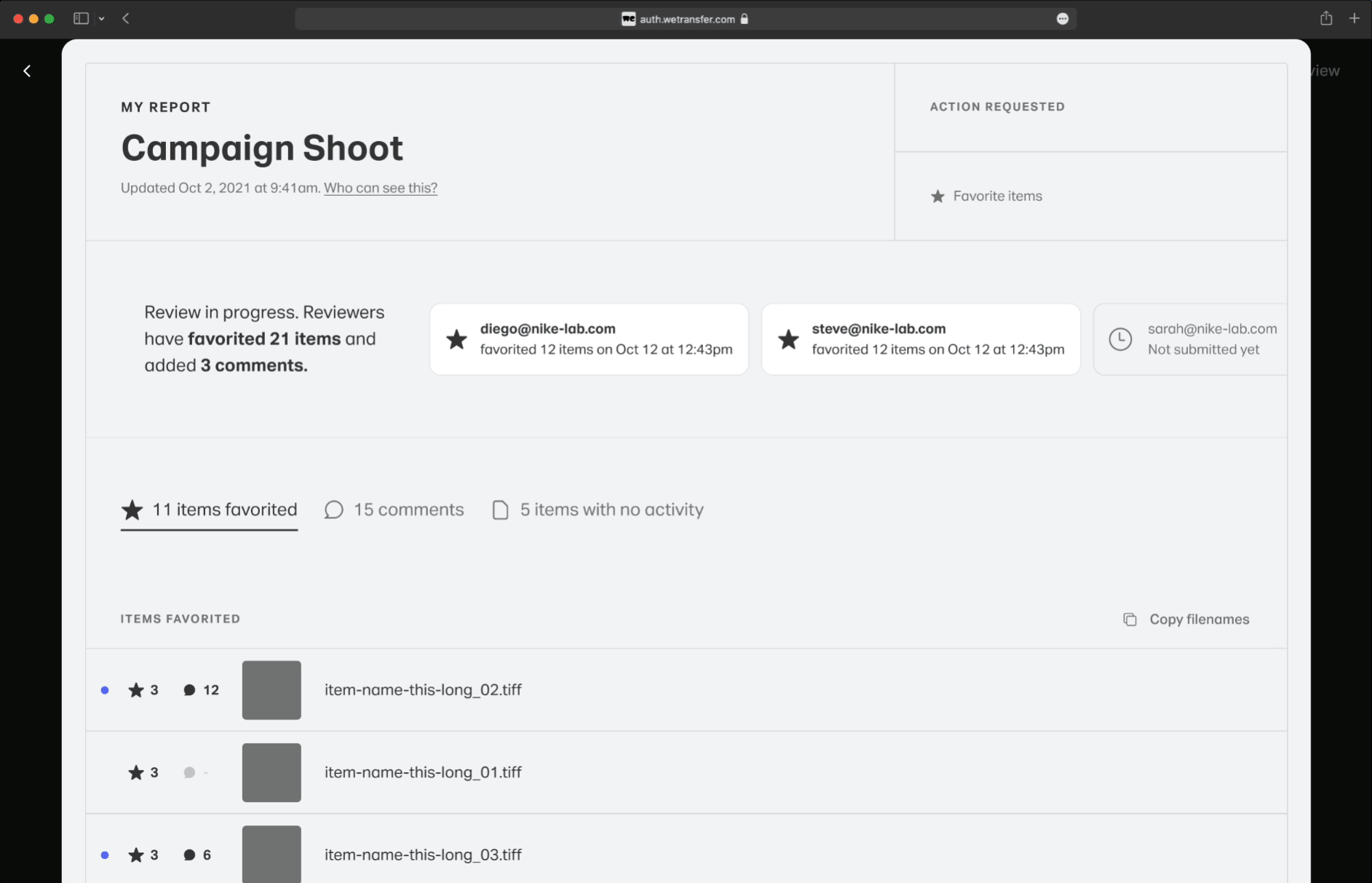
Background
In October 2021 we launched a new product offer called Portals & Reviews. The product allows creative professionals to have dedicated portals for each client where they can create reviews to request feedback and specific actions to their clients.
Problem
The existing solution had information on the review in several places: the review page, the items themselves, and the email notifications making it very difficult to understand the actual status and outcome of a round of feedback.
Solution
Create and overview of all input that can actively be used by the creative as a reference and tool to quickly navigate and apply operations to work through every piece of feedback.
Before & After

Before feedback was all over the review page
User had to check each item to see which one was favorited, approved, or had comments
User had no way to see the name of the item that was favorited or commented
User had to rely on emails to know when reviewers submitted their feedback
User had to navigate to a share panel to know who the reviewer was
User had no way to know which comments had been added since they last read them

After feedback is centralized in the report view
User can filter items by actions, comments, and no activity at all
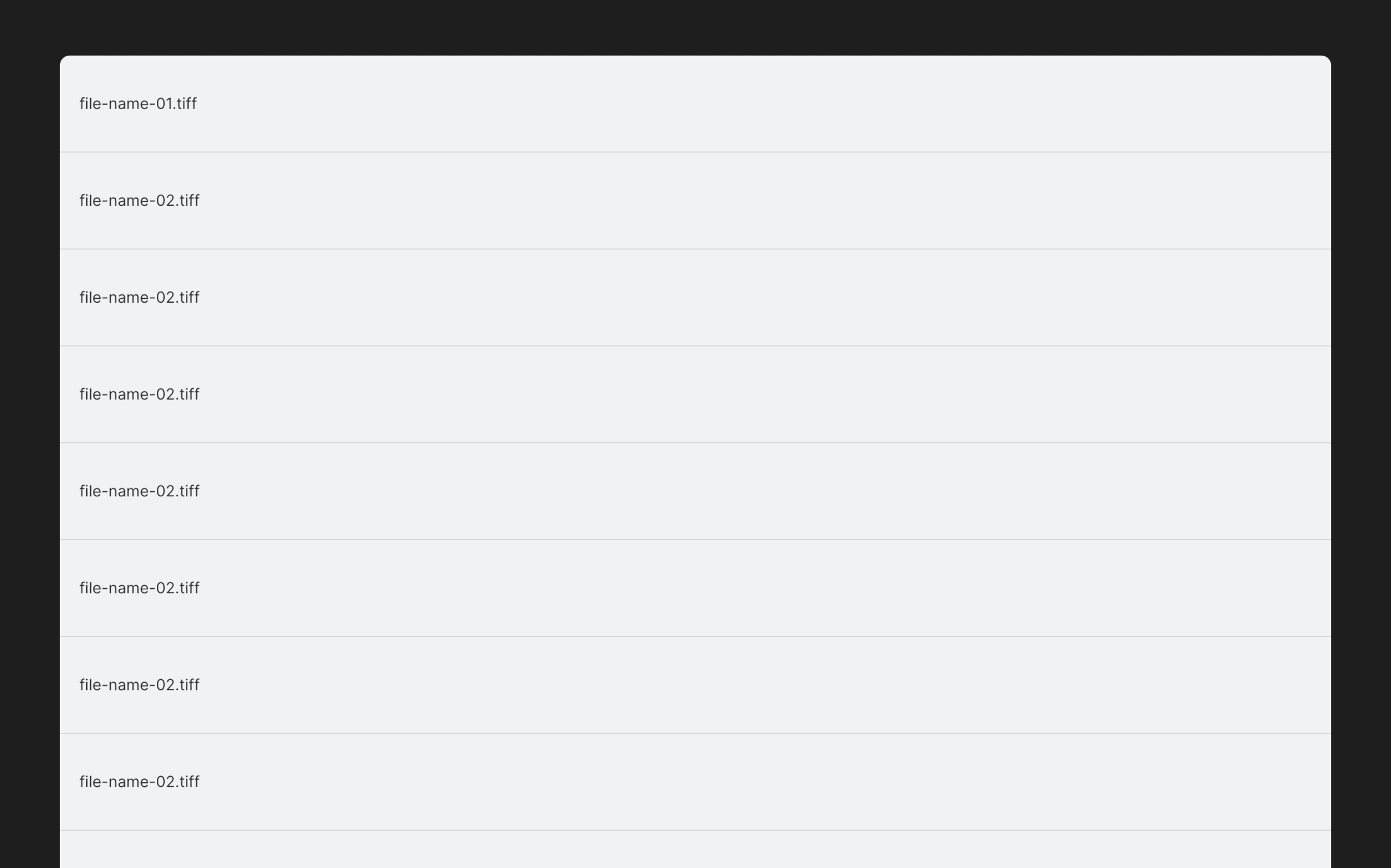
User can copy a list of the filenames resulting from each of the above sorting options
User can see the name of the item that was favorited or commented
User can see reviewers’ status and completion date
User can see which comments have been added since they last read them
Research
"Audit trail for a review, so we can quickly see exactly when a review was approved and by who, if comments have been added, etcetera." — Portal user via our user feedback survey.
The problem and a hint at the solution were identified via user interviews in combination with a user feedback survey we embedded in the product since launch. We collected these answers in Airtable and it became apparent that most users shared similar pains when it came to consuming the feedback they received from clients.
Ideation
Most of the ideation phase was dedicated to addressing the following four critical areas
Content layout
Navigation
Reading comments
Sorting data
1 / Content layout
A big question during the exploration phase was how to visualize this information and what degree of interaction was necessary to get value from it. The word report, which eventually renamed this initiative, came via several explorations as I was pushing for solutions that could be consumed without much interaction from the user.

Direction 3 / What became the final direction of the content layout.
Direction 2 / This was getting closer to the final one, however the relationship between elements was still vague and the two-column layout made it hard to parse the information.
Direction 1 / This felt like you had to do work to get information out from it while we were searching for a solution that felt ready to be consumed.
2. Navigation
Establishing the relationship between the Review and the Report views required a good amount of exploration. Since the Report was showing the same data in a Review, only in a different format, for some time it felt reasonable to keep this information at the same level. That, however, felt overwhelming and somewhat out of place. I explored different ways to get to the report from the review and landed on a similar approach I used in a previous project.
3. Reading comments
Before introducing the floating panel for reading the comments, I explored solutions that would lean in strongly on the one-pager concept. The idea was to let the user decide how much information they needed by expanding and collapsing items. The idea was to display comments for multiple items at the same so users could reference the page as a checklist for their next round of work.
This concept was meant to allow the user to view comments from a few images at the time. Imagine keeping this scrollable view on a second screen while working out the changes.
Alternative hover behavior for line items.
4. Sorting
The items list was the core of this feature. It had to immediately surface items that received any action (e.g.: approval or comments) and offered a way to copy items’ names. A sorting mechanism was introduced to create sub-lists of items that received specific action, comments, or no action at all. This feature allows users to derive simple but insightful information which would have had to be done manually before — arguably not convenient when a review has a thousand items.